Jack’s Big Boy Room Makeover
A nantucket nautical cape cod-ish bedroom makeover for the cutest little man
Jack’s room has gone through a lotttt of changes. It was originally our guest room when we first moved in. Then it ended up being our dumping ground when we were going through our first addition to the house. Next it was his older sisters nursery. Then finally- his nursery! He used to share a nursery with his twin sister, but they were getting each other all riled up and it was affecting their sleep- AND MINE!! So we switched and gave him his own room and it was NOTHING special for the first year or so. I was too busy trying to keep 3 little kids under 3 alive to worry about the decor.
This is the blank slate we started with. One off-centered window, dated trim, patched walls, etc. Not good.
Then it was Quinn’s nursery. Fun fact- this picture was taken 4 days before I went into labor with the twins. Hence why this is the plainest nursery you’ve ever seen. Did. Not. Have. Time.
How it looked when we finally switched him to his own room. Plain plain plain. But he was almost ready for a big bed so I didnt want to spend any energy decorating.
See his little twin Avery coming in for a visit in the new room :-)
The Design Plan
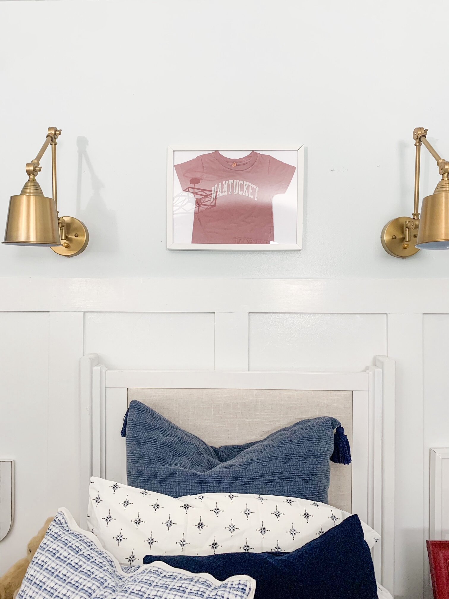
I need to have some idea of what I want the room to look like. His final product isnt this exact replica but its very similar! I knew I wanted a “cape cod/Nantucket” boys room inspired by his tiny little “nantucket” t-shirt I had framed. We live in a beach town but I didn’t want a room that was “themed” or screaming “nautical”.
The Final Product!
The first thing we did was add board and batten to the back wall. It was extra wood we had from another project and I really needed some interest in this tiny plain box of a room. I still plan to add it on the rest of the walls.
Next up I made his headboard and footboard for the bed out of his old crib ends! I loved his crib and thought it would tie in nicely with the rest of the room so I found a way to repurpose it. Blog post on that coming soon :-)
This bedding is by Ugg found at Home Goods and it is amazingggg! So soft and full and fluffy! I love it!
I’m a big fan of mixing patterns! Gives movement to a room in my opinion. This is a shot of his compass sheets from target by poppy and fritz and his comforter.
There’s still so much more I want to do to this room- finish board and batten, possibly add wallpaper, find a larger piece of art, etc. But for now he’s happy to have his very own big boy room made specially for him so that makes me happy too!
E-Design Budget Bedroom Makeover
E-Design budget makeover on your timeline
Everyone can use some design help or inspiration at some point! In comes -> Oak & Harbor. I basically, eat, sleep and breath home decor and styling, so I have plenty of fresh ideas on the brain ready to help! A colleague had sent me some pictures of what style bedroom she wanted… and the bedroom she actually had. I’ll walk you through the steps I took to help plan her bedxroom via an E-Design mock up.
E-Design can be great for a lot of people. Maybe you don’t have the time to design the room, or your not sure how to bring the styles you like together in one room, but you don’t have the budget to drop hundreds (if not thousands) on a designer and all new furniture/decor all at once. With my E-design mock up I do all the heavy lifting for you. Compile a design plan for your room, based off your own specific likes, then provide you with links in your price range to recreate the look on your own timeline.
Below are the “Before” pictures of this particular design. She likes a modern, warm, slightly bohemian california style, from the inspiration pics she sent me, but was not acheiving that in this bedroom.
Design Plan
Her bedroom furniture set was brand new so she wanted to work that into the new bedroom plan. This is what we came up with. Ive listed all the items I picked with links below.
The main part of any bedroom is THE BED! Make it a focal point and somewhere you just want to fall into! I started with this linen striped duvet (link below). I like to keep a duvet folded at the foot of the bed to add extra fluffiness and its perfect to pull up over you on an ectra cold night.
A must have for any fluffy bed is a good base comforter, down quilt, or coverlet. This would be perfect layered under her new duvet. Link below
Every bed needs somde euro pillows as a backdrop. For her King size bed I recommend 3 across the back. I like to use a plain white sham as it allows you to bring in pattern in other parts of the bed (throw pillows, blankets, etc). Link from H&M below
These crisp white curtains would help tie in to the white bedding (euro shams, comforter) whereas the navy blue ones didnt really go with any other elements in the room. I suggested she moved her bed to the opposite wall so it wasn’t in front of the window, but if she isn’t able to do that, painting the walls white and adding these simple white curtains will help make the window placement blend better. Also, the curtain rod needs to be hung a little higher. Link below
I’ve been dying to use these benches in a design! They were sold out for months because they are so versatile and would fit in pretty much any home in any room. They are perfect as “nightstands” in this narrow bedroom. The striped pattern works well with the duvet and the rope/medal legs give it a touch of bohemian cool that she was loving in her inspiration pictures. Plus I love to add a little black into every room. This contrasting stripe is just enough!
Art is always one of my favorite thigns to pick out in a room. It can completely change a space. The exact one I picked for her is no longer available for me to link, but this one from etsy has a similar organic type feel with muted colors and a wood framed canvas that would blend with the other decor beautifully.
Add in a rug with a subtle color and pattern. This isnt the exact rug I linked for her, as its not sold anymore, but again this one is similar and ties in the colors from the artwork.
Added this blackmedal frame mirror for above her bureau. It’s sleek to add to that modern cool vibe she likes and it doesn’t take up a lot of space (since they don’t have a ton to spare)
Need to add in a little table lamp- this one has a nice natural vibe
A black and white nautical print (a nod to our seaside little town)
Ways for you to contact me for all your e-design questions:
tiamaria353@gmail.com
through the Oak and Harbor website
through the Oak and Harbor instagram


